Source: Fortune
Summary
Pantone named “Cloud Dancer,” a white shade, as its 2026 Color of the Year, marking the first time a white has been chosen since the program began in 1999. The company described the color as serene and reflective. However, current design trends, especially among Gen Z and millennials, favor maximalist, colorful aesthetics over minimalist white spaces. Pinterest predicts a rise in “gummy bear” aesthetics, with bold colors and textures. Interior designers note that color can influence mood and that white, while calming, may also feel sterile depending on context.
Our Reading
The numbers tell one story.
Pantone picks white as its 2026 color, a first in 27 years.
Gen Z and millennials prefer bold, maximalist designs over clean white spaces.
Pinterest forecasts a rise in “gummy” aesthetics and ASMR-driven decor.
White is seen as a calm canvas, but it’s not the only path to comfort.
Author: Evan Null
From ‘dopamine decor’ to ‘gummy bear aesthetic’
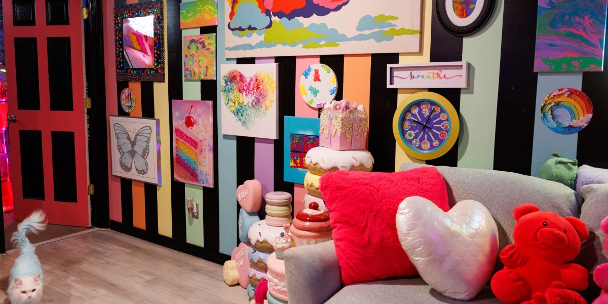
Terms like “dopamine decor” and “gummy bear aesthetic” are defining 2026 design trends. These styles emphasize bold colors, textures, and sensory experiences. Interior designers with backgrounds in mental health suggest that color choices can affect well-being. Lori Miller, an interior designer, notes that while white is calming, many people prefer more color and contrast for a sense of peace.
Miller’s experience in mental health and social work informs her view on how design impacts emotional states. She says that while white can be serene, it can also feel sterile. The trend toward maximalism reflects a desire for comfort and joy, especially among younger generations.
Researchers have found that Gen Z and millennials are experiencing rising anxiety and financial stress. This may explain the appeal of colorful, tactile design elements that provide a sense of comfort and joy. The “gummy bear” aesthetic, with its rounded shapes and bright colors, offers a visual and sensory escape from the pressures of modern life.
Designers like Betsy Wentz argue that color and texture are not just visual choices but emotional ones. She believes that the right color can make a space feel safe and welcoming. This idea aligns with the broader trend of using design to create a sense of well-being, especially in a time of uncertainty.
Despite the popularity of maximalist design, white still has a role in creating a calm, neutral base. Wentz suggests using white as a canvas for bolder, more colorful elements. This approach reflects a balance between the desire for comfort and the need for visual stimulation.
Nostalgic craving for comfort and safety
The current design trends reflect a broader cultural shift toward nostalgia and comfort. Gen Z and millennials are embracing retro aesthetics and maximalist styles as a way to cope with the stresses of modern life. This trend is also seen in fashion, where conspicuous spending on bold, colorful items is on the rise.
Wentz notes that the shift away from minimalist, white-dominated spaces is a reaction to years of “beige algorithm homes” and a world that feels unpredictable. She suggests that the “gummy bear” aesthetic, with its rounded shapes and saturated colors, offers a sense of safety and comfort. This design style is meant to feel inviting and approachable, much like the idea of a “gummy bear” itself.
The trend also reflects a desire for sensory experiences that provide a sense of calm and joy. ASMR, or autonomous sensory meridian response, is a key part of this movement, with people seeking out soft, tactile experiences that trigger a sense of relaxation. This is evident in the popularity of “gummy” design elements that look and feel like they can be touched or squeezed.
Designers are encouraging clients to engage with their spaces on a sensory level, touching fabrics and textures to find what feels good. This approach highlights the emotional impact of design and the importance of creating spaces that feel good to be in. It also reflects a broader cultural shift toward valuing comfort and well-being in everyday life.
Despite the rise of maximalist design, white still has a place in creating a sense of calm and order. Wentz suggests using white as a base for bolder, more colorful elements, creating a balance between the need for comfort and the desire for visual stimulation.
Chasing dopamine while cutting spending
The rise of “gummy bear” design and other maximalist styles is part of a broader trend of seeking small dopamine hits in a time of economic uncertainty. Gen Z and millennials are cutting back on spending but still looking for ways to feel good. This has led to a focus on affordable, colorful, and tactile design elements that provide a sense of joy and comfort.
Color has long been associated with emotional well-being, and this is reflected in the popularity of bold, vibrant shades. The recent surge in interest in “Barbie pink,” for example, shows how color can carry cultural and emotional weight. This trend suggests that people are looking for ways to express themselves and find joy in their surroundings, even in times of financial stress.
Designers are encouraging clients to focus on the sensory experience of their spaces, rather than just the visual aspects. This includes using soft, textured materials and incorporating elements that feel good to touch. The goal is to create spaces that not only look good but also feel good, providing a sense of comfort and well-being.
While the trend toward maximalism and bold colors is growing, it’s important to find a balance. Wentz suggests using white as a base for bolder, more colorful elements, creating a sense of calm while still allowing for personal expression. This approach reflects a broader cultural shift toward valuing both comfort and creativity in design.
The popularity of “gummy bear” design and other maximalist styles shows that people are looking for ways to find joy and comfort in their surroundings. This trend reflects a desire for sensory experiences that provide a sense of calm and well-being, even in a time of uncertainty and economic stress.
White as a calm canvas
Despite the rise of maximalist design, white still holds a place in creating a sense of calm and order. Wentz suggests using white as a base for bolder, more colorful elements, creating a balance between the need for comfort and the desire for visual stimulation. This approach reflects a broader cultural shift toward valuing both comfort and creativity in design.
White has long been associated with cleanliness and simplicity, and this perception has influenced design trends for years. From Scandinavian design to Apple Stores, white spaces have been seen as a symbol of order and control. This cultural association may explain why white is still seen as a calming color, even if it’s not the only choice for creating a peaceful environment.
However, the effectiveness of white as a calming color may depend on the context. Wentz notes that white can feel sterile or cold, depending on the environment. This suggests that while white can be a useful tool in design, it’s not a one-size-fits-all solution. The key is to use it in a way that enhances the overall sense of well-being.
Designers are encouraging clients to think about how different colors and textures affect their mood and emotional state. This includes using white as a base for bolder, more colorful elements that can provide a sense of joy and stimulation. The goal is to create spaces that are both calming and engaging, offering a balance between comfort and creativity.
As design trends continue to evolve, the role of white in creating a sense of calm and order remains important. While the rise of maximalist styles suggests a shift away from minimalist, white-dominated spaces, white still has a place in creating a sense of balance and harmony in design.
The role of belief in design
Wentz suggests that the calming effect of white is not just about the color itself, but about the belief that it can provide a sense of order and control. This idea reflects a broader cultural shift toward valuing the emotional impact of design. The perception of white as a symbol of calm and cleanliness may be more important than the color itself in creating a sense of well-being.
This belief in the power of design to influence mood and emotion is not new. Throughout history, color and texture have been used to create specific emotional responses. From the use of blue and green in nature-inspired designs to the use of bold, vibrant colors in maximalist styles, design choices have always been tied to emotional well-being.
As design trends continue to evolve, the role of belief in the effectiveness of certain colors and styles remains important. This suggests that the emotional impact of design is not just about the physical elements, but also about the cultural and personal associations people have with them. This is why white, despite its potential to feel sterile, is still seen as a symbol of calm and order.
Designers are encouraging clients to think about how different colors and textures affect their mood and emotional state. This includes using white as a base for bolder, more colorful elements that can provide a sense of joy and stimulation. The goal is to create spaces that are both calming and engaging, offering a balance between comfort and creativity.
As design trends continue to evolve, the role of white in creating a sense of calm and order remains important. While the rise of maximalist styles suggests a shift away from minimalist, white-dominated spaces, white still has a place in creating a sense of balance and harmony in design. This reflects a broader cultural shift toward valuing both comfort and creativity in design choices.